menu
Building a brand that lets investors also invest their trust in an educational holding created by a recent merger: a riveting brief. The goal wasn’t creating a university brand with campus feel but an identity which signals substance and investment maturity.
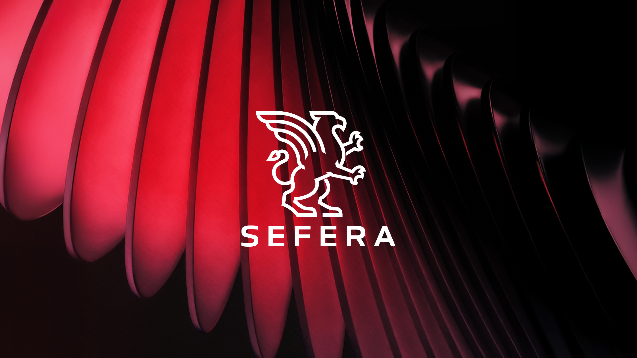
At the center: the griffin. As a design and word mark which is half lion and half eagle, it symbolizes the moulding of four countries’ coats of arms. Complemented by a color code in its own right, a deliberate font system and a visual approach that takes the griffin motif into the contemporary.
All captured in a brand guide that makes Sefera palpable.
Behind Sefera is a fusion of two educational companies from Germany/Austria and Luxemburg/Czech Republic—six institutions, four countries, more than 100 fields of study and roughly 20,000 students. The name goes back to the ancient Egyptian “Sefer“, the mythical lion eagle, so the story of fusion is part of the name already.
How do you make a brand trustworthy when it does not address students but gives capital investors direction? By giving it clarity, heft, and visual depth.
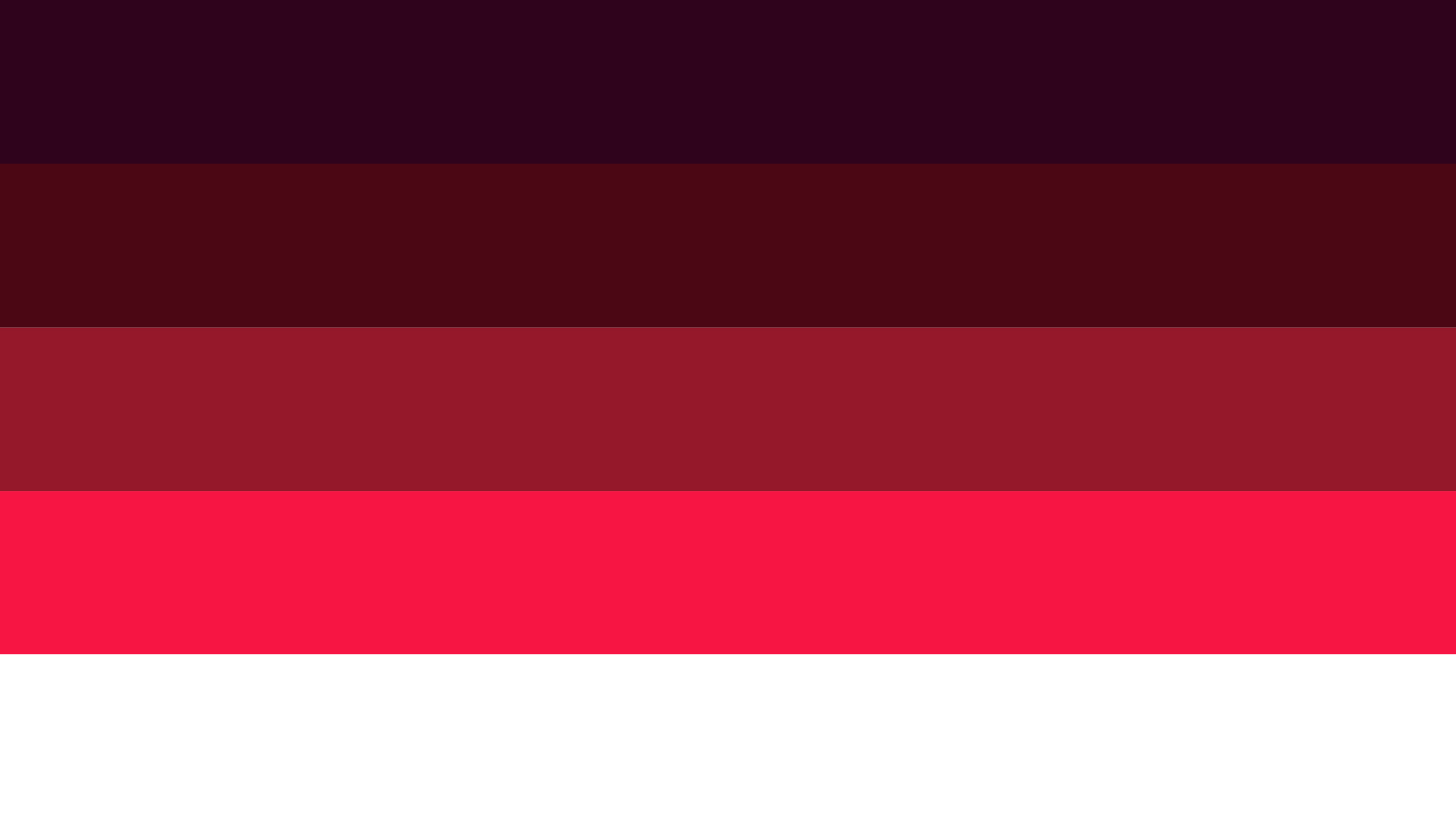
The stylized griffin combines clear lines with the clout of an centuries old heraldic animal motif. In terms of color, a sequential palette of red ranging from light red to maroon provides a solid anchor and is supported by an off-white—unique enough to be recognizable, composed enough to work in a financial context.
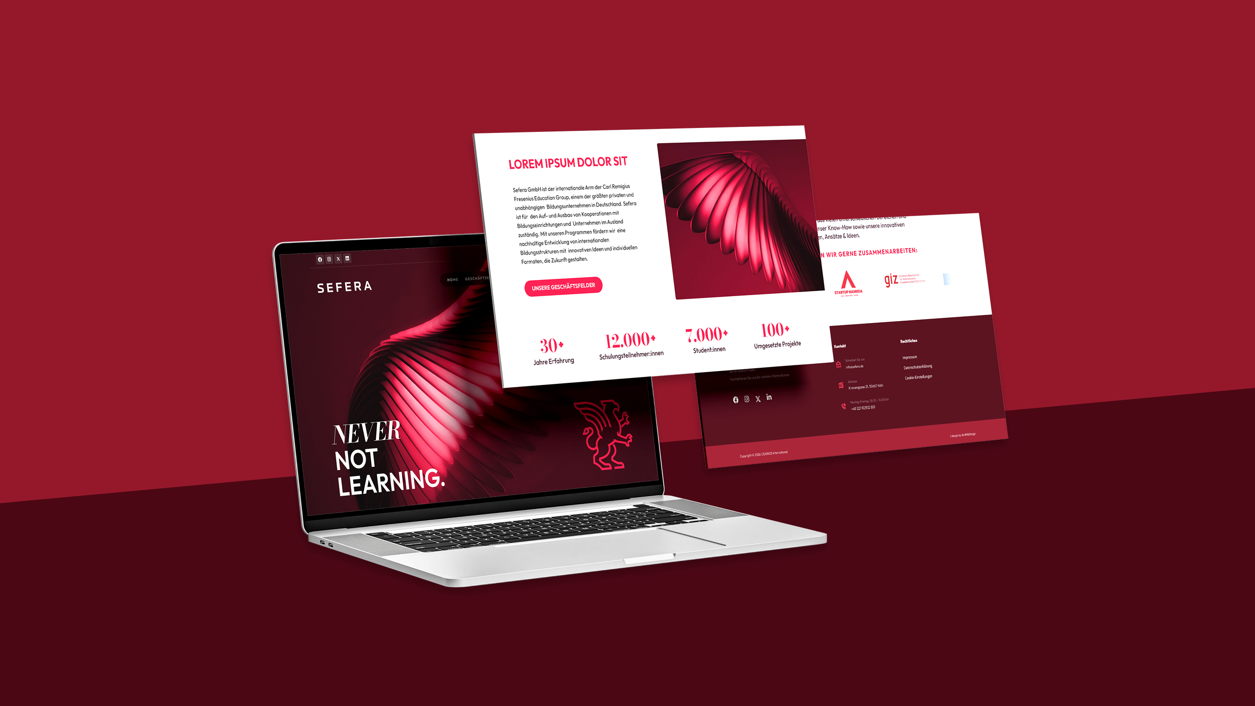
“Outfit"sets the tone as a very straightforward main font; “Bodoni Moda" creates a feel of tension between restraint and elegance when it comes to figures and emphasis.
Instead of resorting to stock images, we apply one-of-a-kind imagery in the form of CGI close-ups of feathered wings—sculptural, in the brand colorway, atmospherically between nature and technology.
The new Sefera brand: Built for boardrooms not auditoriums.